Skoda Octavia 1.6 Greenline Business
Skoda promises a spacious, safe, comfortable eco-giant with it's new Octavia. But have they been paying enough attention to the user interfaces and multimedia system? UNITiD put the car to a test.
Skoda promises a spacious, safe, comfortable eco-giant with it's new Octavia. But have they been paying enough attention to the user interfaces and multimedia system? UNITiD put the car to a test.
As soon as you open the door it becomes clear that the dashboard is pretty standard. Despite the RVS look and glossy black accents on the dashboard, the Octavia has a dull dash.
Fortunately, the multimedia system has some more color to it. The green from Skoda's logo is thoughtfully applied as highlight color and logo's from available radio stations are presented on screen.
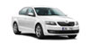
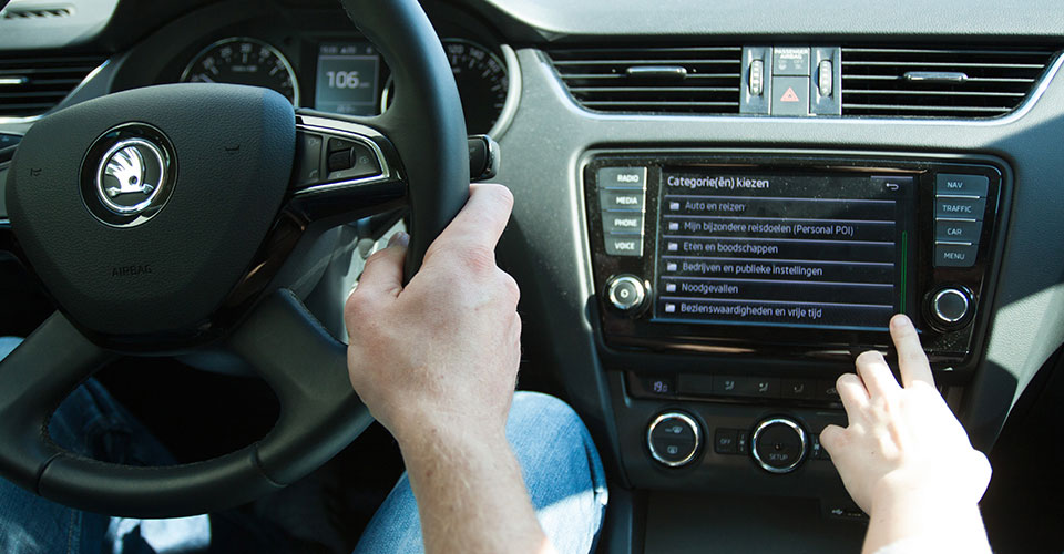
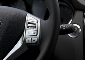
The majority of settings can be directly altered on the touchscreen. Various physical buttons surround the screen that can also provide input to the screen, allowing decent input options even while driving. The combination of input from touch and physical buttons can however feel slightly confusing at times.
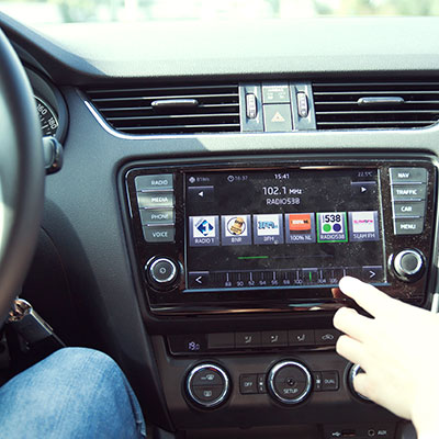
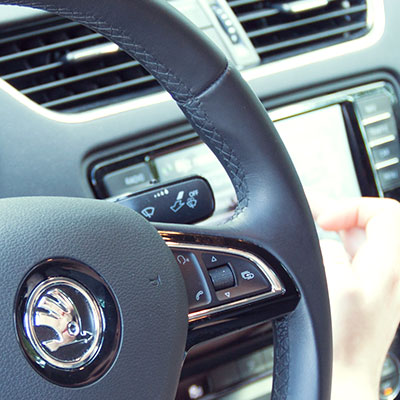
What we really like is the proximity sensor of the screen that makes sure that the input buttons appear on screen once the hand comes close and makes them disappear once you're done. This keeps the screen clear of unnecessary options while driving and keeps it tidy and clean.
The UI 'proximity detection' is really cool, and a solution for crowded, small screens. It keeps the screen clean while driving
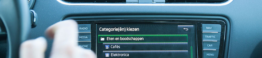
The climate control is operated by a combination of physical buttons and the touchscreen. This combination of controls is quite confusing and we found ourselves repeatedly tapping the touchscreen without result.
The thin accent stripes seen in the car's interior are also present as highlights in the interface. Skoda mainly uses various shades of grey combined with the green color from it’s logo as accent. While this feels a bit dull and does not create a luxurious feel, it’s consistent use creates a coherent feel and balance between displays and car interior. Display items consistently follow this scheme. Icons however, seem pretty randomly designed and randomly applied throughout the interface. Some icons are clearly obsolete, while icons are missing at places where a clarifying icon would help understanding a complex menu structure and enhance user friendliness.
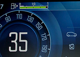
All display content is well readable despite the dull, grey displays. Even during the day when the sun shines upon the screen. The physical buttons are highlighted by small green accent lights that light up in the dark. This makes them easier to find and operate while they do not distract from driving.
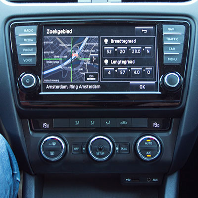
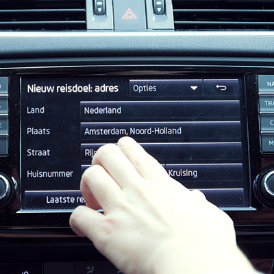
The main menu clearly lists the top tasks, making them easy to access. On top of that, hardware buttons along the sides of the display allow us to directly jump to the various functions. The navigation system works decently. We like the autocomplete function while searching for an address and are charmed by the simple destination preview with nearby parking locations. In contrast, the search results seem quite random and the uncategorised list of Points-of-interest don't really help out. The map-within-map is something we really don't get: why would anyone want to see the same map twice on a single small screen?
The overall usability of the system is fine. The media system is equipped with proximity sensors that detect if a finger is close to the display or not. This neatly hides unnecessary controls while driving and conveniently places them back once you show intention to interact with the system. We think this is a nifty little addition although it makes it unclear at times what interactions are possible without almost having to touch it.
Inconsistency in control At times, swiping or dragging actions are available, while on other screens only button control is supported. This makes controlling quite confusing.
The radio control is a good example: On screen, both the radio stations and radio frequency are displayed as a horizontal line of items. The frequency bar is controlled by dragging and tapping the bar, while the radio stations are only browsable by left and right buttons: dragging or swiping of this bar is not supported. This inconsistent mix of interaction styles, found at various places in the system, makes it hard to predict how items should be interacted with.
The Octavia provides all the technical features one would expect on a Business edition. We are quite charmed by the various warnings and alerts that are displayed in a clear way. The proximity detection of the screen that allows decluttering is something we think more cars should integrate.
COMMENTS