Mercedes C220 dashboard
Mercedes C220 small

Mercedes-Benz C220 CDI Ambition Comfort

Mercedes-Benz continues to make progress. Recently there’ve been several new versions of current models introduced. This also includes a new C-Class: one of the most famous models from Mercedes-Benz. We at UNITiD took a good look at the C220 CDI.

  • UI fits with the interior
  • Legible and clear screen
  • Dashboard screen feels cheap
  • Use of color is not always consistent
 

THE TEST

Interior and UI in line with the car

Interior and UI in line with the car Mercedes-Benz wants to appeal to a younger audience. Therefore the multimedia system looks glossy, with some traditional and classic details. The entire look is very much in line with the level of class Mercedes-Benz is known for, impressive.

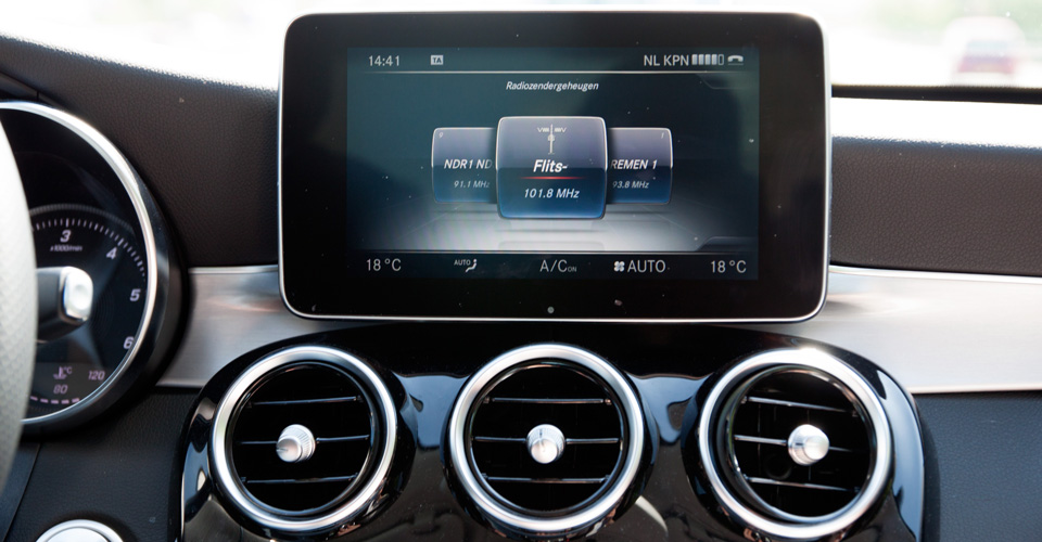
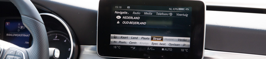
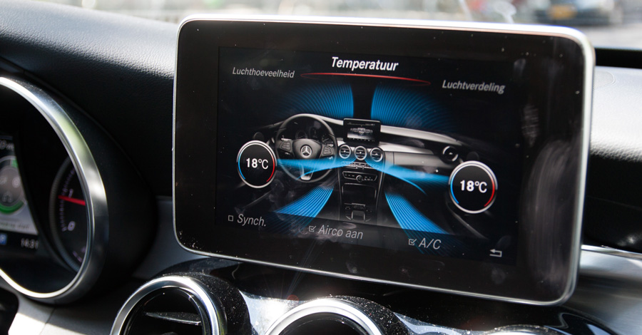
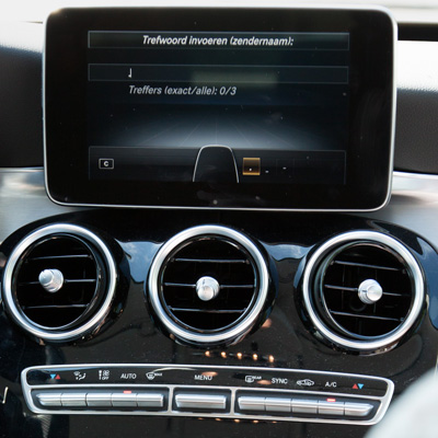
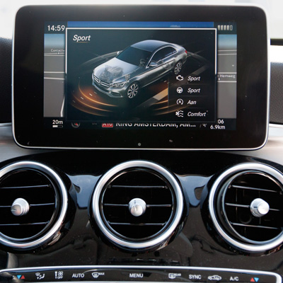
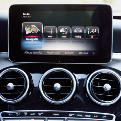
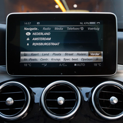
The rotary knob and the touchpad are incorporated in the dashboard and look stylish. But it takes some time to get used to the rotary knob and the touchpad. It also takes some time to get used to the fact that there is a lot of information on the screen. The options are endless, so it is often difficult to choose. It is also confusing that you can get to sub-tasks in different ways. Also, the touchpad does not always work intuitive, for example when deleting data.

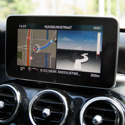
The screen on the dashboard can be easily viewed from the driver seat. Even in daylight, the screen is still legible. It’s to bad that the screen does not always automatically switches to the correct light mode when you're in a tunnel or dark environment. In a tunnel, the screen is pretty bright, but this is not distracting or blinding.

Interior and UI in line with the car
The car is equiped with some interesting technical features. Like the touchpad with wich you can handwrite while driving.

REMARKABLE

High class

High class

Mercedes-Benz is well known for its elegance. Not only are the models named after a class, also the cars themselves are full of class. This also applies to the C220 CDI. The multimedia system shows its fine class. Still, the screen looks a bit cheap. It feels like a cheap tablet placed on the dashboard.

SCORES

Tested on May 5 2014 by Hylke van Maaren, Miranda Schenkel and Niels Mulder

Identity

75

The detail that was applied in the finish of the Mercedes-Benz, is properly implemented in the interface. The dashboard display and boardcomputer have the same style. And everything matches: fonts, colors, lines and the glossy elements. Beautiful visualisations are also used, for example, when a car drives away. In fact it is only the appearance of the screen that’s disappointing and the fact that it is not implemented into the dashboard.

Identity

Hardware

85

The build quality of the screen is disappointing, it looks like here is cut back on. Your instinct tells you it's a touchscreen, but you can only operate it with a rotary knob.

The rotary knob and the touchpad feel like they were made of good quality as you would expect in a Mercedes-Benz. Perfect in line with the other buttons in the car. The beautiful line around the display is also apparent in other elements of the interior.

Hardware

Toptasks

70

The visualisation of the information, such as the fuel consumption, is quite complex. It is not intuitive at all. However, the warnings are clear to the driver. By using tiles, the top tasks are very quickly found. But the icons look more like illustrations than icons. They are quite detailed, which of course matches the build quality of the car. However, the icons therefore are not always clear to the user.

Toptasks

Usability

70

When you, as a user, want to fill in something, it may take a while to get used to. There are various locations the information can be found. There are also many duplicate menus, so the focus is lost. While driving this is very annoying. We expected something better from Mercedes-Benz. The primary colors are blue and orange. This shows when you, for example, activate a section. Yet the colors are not used consistently throughout. Sometimes it is blue and sometimes it's orange. All other colors have a clear function, though.

Usability

Technology

70

There are some cool technical features included, such as the touchpad which you can write while driving. It takes some time getting used to, but while driving it is a lot safer because you don’t have to look at the keyboard; you can keep your eyes on the road.

Furthermore, there’s not much extras you can do with it. The combination with the small digital display in the instrument panel works very good. Optionally, you can get Apple CarPlay and a heads-up display, our copy unfortunately did not have this.

Technology

COMMENTS

comments powered by Disqus