Opel Insignia Sports Tourer Business+ 2.0 CDTI
The Opel Insignia is the parade float of Opel. The promising exterior of the car made us curious about the rest of the car. Is the interface as beautiful and good? We went out to explore the Insignia.
The Opel Insignia is the parade float of Opel. The promising exterior of the car made us curious about the rest of the car. Is the interface as beautiful and good? We went out to explore the Insignia.
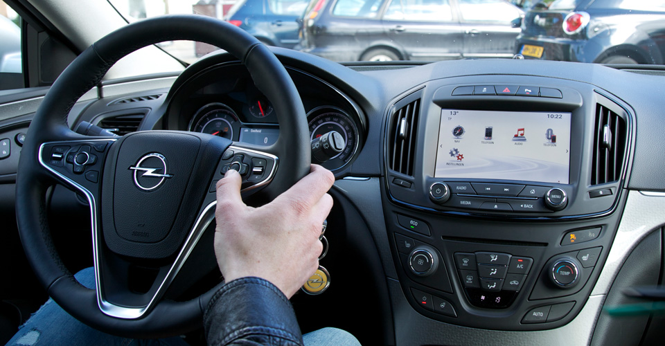
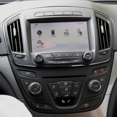
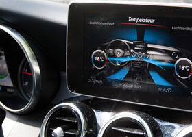
After boarding it is hard to ignore the screen. It is a big boy that takes a prominent place on the dashboard. The buttons are all nicely rounded and neatly positioned below the display. Fortunately, there are less buttons than in the previous version of the Insignia. This makes it more quiet for the driver. So prominent and large as the central display, so smallish look the analogue gauges for speed and speed. They are however beautiful, although from time to time we had to give it some effort, to see what the current speed was, when it was not given on the small display.
The information on the dashboard screen is clear. The fuel consumption and range are displayed in submenus. That are accessible by controls on the steering wheel. The menu structures are divided both vertically and horizontally, and that gives some confusion within such a small screen. Unfortunately no warnings are displayed on the screen.
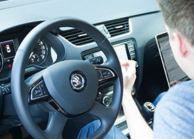
Interaction by way of touching the screen works moderately. This is because not all of the controls are effective. The knob works fine, but requires a lot of concentration. You have to long press the screen looking for the illogical structure of options. The buttons on the steering wheel work, but are confusing with what happens next in the menu. The touchpad that is part of the center console, is designed to facilitate the easy input of information. For example, you can draw figures. However, this requires a lot of attention from the driver, making it more a funny gadget than a functional addition that you will use often.
I need to scan the screen and really understand what is going on in order to go to the next step.
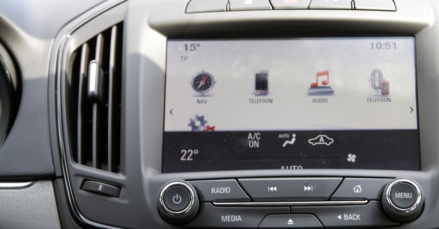
There is no consistent use of the styles of the icons: you get both flat and lavish icons against: thin line icons to thick line icons and icons with bevels, gradients and shadows. In the colors of the icons is no unity. A different set of icons In addition, there is used for the hardware buttons.
The screen is well integrated in the center console, which ensures a beautiful whole. The small digital display integrated into the dashboard, is well adapted to the analog speed and fuel indicators. Unfortunately, the touch screen feels cheap and it works slowly. We did expect more from a mid-range car from Opel.
Design
The buttons you see on the screen are inconsistent: some buttons are placed in a box and other buttons not. Also the sizes of the buttons differ. This coupled with the lack of a logical visualization of your action is unclear what features or tests you are using. That way you have to first sift through the entire screen to understand what is happening, and then go to the next step.
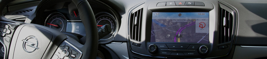
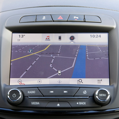
The screen itself is very readable. The only problem is that the screen is deeply incorporated in the console: two to three inches deep. This obscures the buttons, which are placed close to the edges. The "Favorites" button for example, placed in the lower right corner, you can not even see when you sit low or stoop slightly.
Nightmode
The display switches to night mode at night, but also when entering a tunnel for example. The black background with light lettering is ideal for driving in the dark. However it takes between four and five second, before the night mode is activated. As a result you are dazzled by the display when entering a tunnel. And when you are out of the tunnel it takes a few seconds before you can read anything again. Also the switch in light intensity is inmediatlye, and not gradually. This is very noticeable and a bit distracting.
The items in the main menu are "audio", "navigation" and "telephone". When you open one of these items you quickly get lost because of the large amounts of options, controls and buttons. Visual hierarchy is missing here. For example, there is no focus on top or subtasks and even the 'next' and 'previous' options are not used consistently. For example, the 'back' button varies from bottom right to top left, depending on the menu where you are in. This ensures that for any user it is hard to operate the system in a logical and natural way.
We think there are too many interaction mechanisms to control the interface. And they all work in a different way. This is confusing. The center console can be operated by touch, but has an inconsistent use of button forms and sizes. Also, some buttons are not suitable for touch while driving, such as the keyboard for the phone. The way of operating is sometimes disappointing: for instance you can not swipe through a long list. And you are forced to use the arrows to navigate from top to bottom. Also the volume control can only be used one button long press.
The labels are confusing. On the home screen there are two items, both of which have been labeled "phone" while they have a different function. You have to set up a radio station to read the manual. And even that is not clear enough.
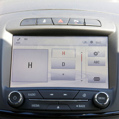
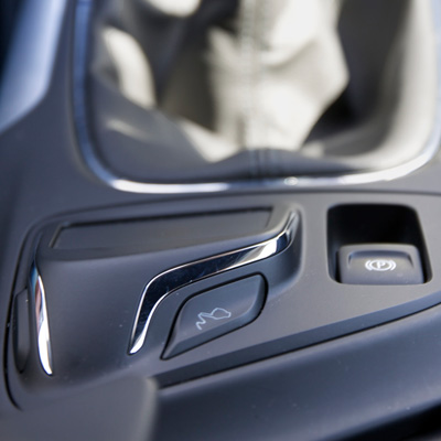
The Insigina features a touchpad that belongs to the center console. This is located next to the handbrake. The touchpad can be used as "drawing pad" for entering text or numbers. You activate it with a button that is next to it. Every action with the touchpad requires text input, for example destinations in case of navigating. Although the letter recognition works reasonably well, drawing letters takes quite some effort and time. The fact that no support is offered in the form of predictive results or filters based on the current input, this input method is very time consuming and error prone. Another small annoyance is that the touchpad does not have an 'ENTER' or 'OK' option. This means that you still need to touch the screen to proceed to the next step. Actually, if you want to enter anything, the on-screen keyboard works so much faster and easier.
COMMENTS